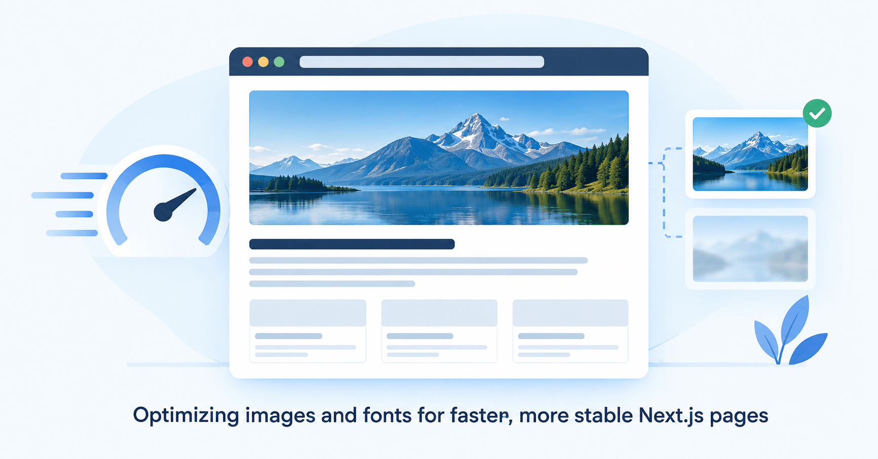

Next.js image optimization is the difference between a hero section that loads instantly and one that quietly wrecks your Core Web Vitals score. Over the last two posts in this series, we defined the rules of the game (LCP, CLS, INP) and learned how to ruthlessly cut JavaScript bloat using Server Components and dynamic imports.
But open the network tab on almost any modern web app and JavaScript is rarely the heaviest thing on the page. That honor usually goes to visual assets: images and fonts.
Also Read:
An unoptimized hero image or a heavy set of custom web fonts can single-handedly destroy your Largest Contentful Paint (LCP) and trigger massive Cumulative Layout Shift (CLS). This post covers five concrete Next.js image optimization and font techniques for 2026:
- Automatic responsive sizing and AVIF conversion via the
<Image>component - Lazy loading plus the
priorityprop for your LCP element - Blur placeholders to kill image-based CLS
- Self-hosted, size-matched fonts with
next/font - Variable fonts to cut font payload
Let’s go through each one.
The Problem with the Standard <img> Tag
Historically, adding an image to a site was simple:
html
<img src="/hero.jpg" alt="Hero Image" />
In modern performance engineering, that plain tag is a liability for a few reasons:
- Over-downloading: Serve a 3000px-wide image and a phone still downloads the full file, burning the user’s bandwidth and battery.
- Format inefficiency: Standard JPEGs and PNGs are heavy compared to next-generation formats.
- Layout shifts (CLS): Without explicit dimensions, the browser doesn’t reserve space. When the image finally loads, it shoves the text below it down the page.
- Eager loading: The browser tries to fetch every
<img>on the page immediately, competing with your critical CSS and JavaScript for bandwidth.
Solving this natively means writing bulky <picture> tags with multiple <source> elements per viewport and format, standing up an image-resizing server, and wiring up IntersectionObserver scripts for lazy loading by hand.
Or you can just use Next.js.
Next.js Image Optimization: How the <Image> Component Works
Next.js image optimization is largely automatic once you switch to the next/image component. Here’s the same hero image, optimized:
jsx
import Image from 'next/image';
import heroPic from '@/public/hero.jpg'; // Static import

export default function HeroSection() {
  return (
    <Image
      src={heroPic}
      alt="A beautiful landscape"
      placeholder="blur"
      priority
    />
  );
}
What Next.js Image Optimization Actually Does Under the Hood
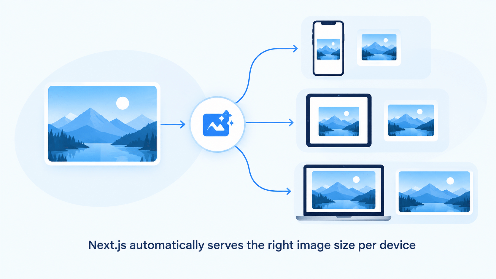
- Automatic responsive sizes (srcset): Next.js generates multiple resized versions and injects a
srcset, so mobile phones pull the 640px version and desktops pull the 1920px version. - Next-gen formats: If the visitor’s browser supports AVIF, a format that typically compresses noticeably smaller than WebP and JPEG at comparable quality, Next.js converts and serves AVIF automatically.
- Lazy loading by default: Images only download when they’re about to enter the viewport.
- The
priorityprop: If an image is your LCP element, like a hero banner, addpriority. It disables lazy loading and injects a<link rel="preload">tag, forcing the browser to fetch it right away.
Preventing Layout Shifts with Blur Placeholders
Next.js image optimization isn’t just about file size. The <Image> component requires a width and height, unless you’re using a static local import, in which case Next.js calculates both at build time. That alone kills image-based CLS.
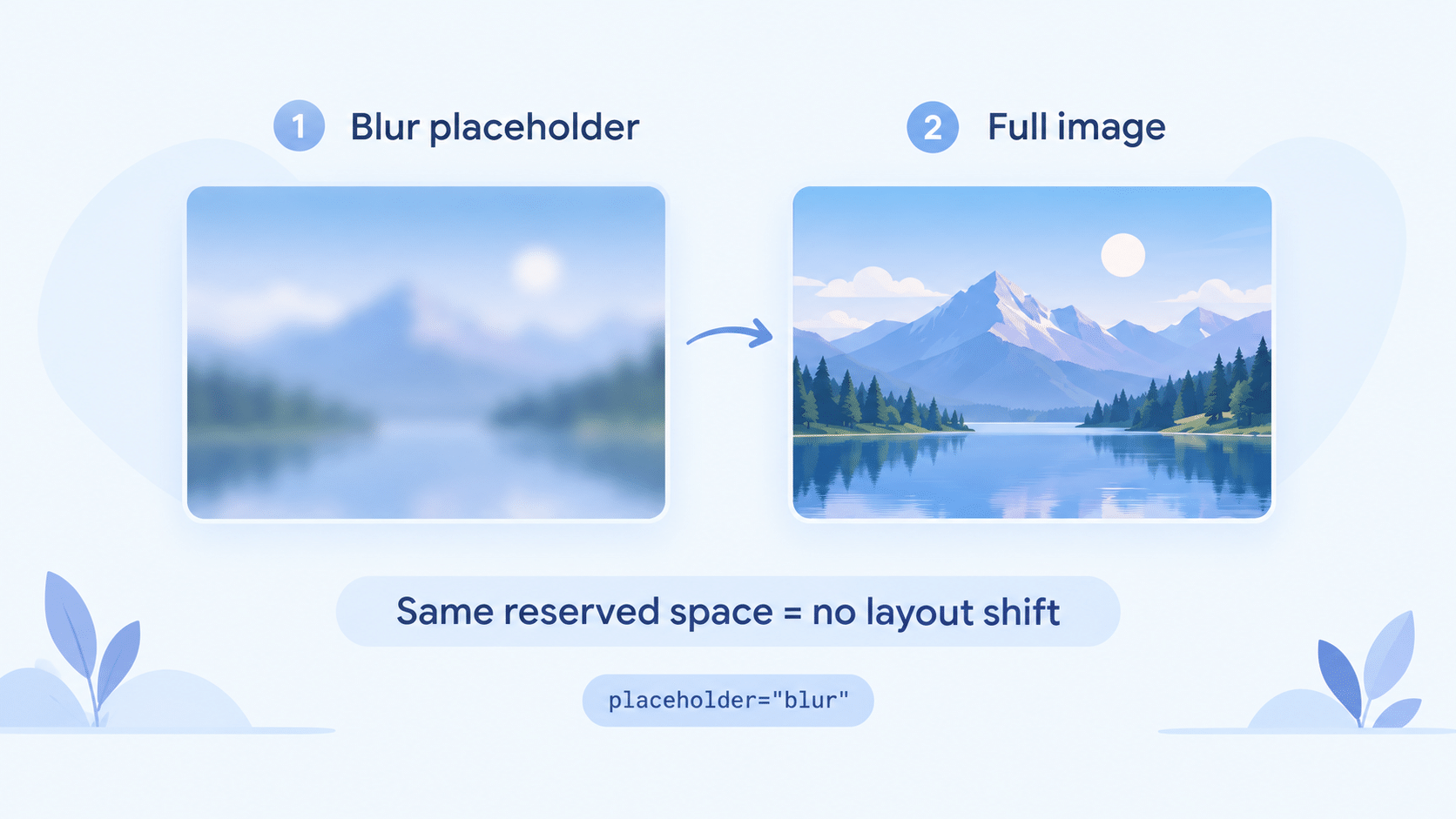
You can go one step further for perceived performance. Adding placeholder="blur" makes Next.js generate a tiny, roughly 10-byte base64 blur version of the image. That blur fills the reserved space instantly while the full-resolution file downloads.
If you’re pulling images dynamically from a database or CMS, where there’s no static import to inspect, generate blur URLs server-side with a library like Plaiceholder:
jsx
// Dynamic image with a server-generated blur data URL
<Image
  src={article.coverImageUrl}
  alt={article.title}
  width={1200}
  height={630}
  placeholder="blur"
  blurDataURL={article.blurHashBase64}
/>
Typography: Taming Web Fonts
Images aren’t the only visual asset causing CLS. Fonts cause two classic problems:
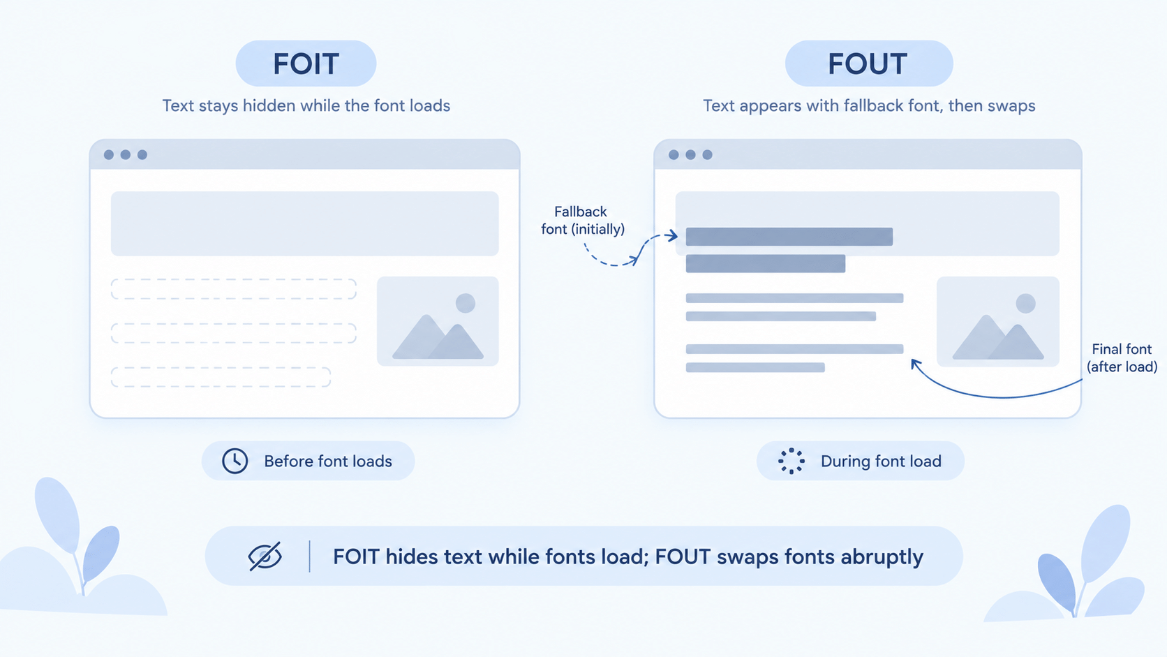
- FOIT (Flash of Invisible Text): The browser hides text completely until the custom font finishes downloading.
- FOUT (Flash of Unstyled Text): The browser shows a fallback font, then snaps to the custom font once it loads. Because the two fonts have different character widths, the layout jumps.
The next/font Fix
The next/font module solves both problems at once:
jsx
import { Inter } from 'next/font/google'

// 1. Configure the font
const inter = Inter({
  subsets: ['latin'],
  display: 'swap',
  variable: '--font-inter',
})

// 2. Apply it at the root of your application
export default function RootLayout({ children }) {
  return (
    <html lang="en" className={inter.variable}>
      <body>{children}</body>
    </html>
  )
}
Why this matters for Next.js image and font optimization together:
- Self-hosting at build time:
next/fontdownloads Google Font files during the build and serves them from your own domain. Visitors never hitfonts.googleapis.com, so you skip that DNS lookup and TLS handshake entirely. - Near-zero layout shift:
next/fontcalculates the exact metric differences between your custom font and the system fallback, then generates a hidden@font-facerule usingsize-adjust,ascent-override, anddescent-override. The fallback font takes up the same physical space as the real one, so there’s nothing to shift when it swaps in.
Why Variable Fonts Matter
Notice the config above never specifies individual weights like 400, 600, or 700. That’s because Inter is loaded as a variable font. Older setups forced you to download separate .woff2 files for Regular, Bold, and Italic. A variable font packs every weight and style into a single file. Stick to variable fonts, such as Inter, Roboto Flex, or Geist, to cut your font payload significantly.
CDNs and the Edge
No matter how well you compress an AVIF image or a WOFF2 font, physics still applies. If your server sits in New York and a reader is in Mumbai, the bytes still have to travel.
Even great image optimization only gets you halfway there. Optimized assets still need to live on a Content Delivery Network. Deploy a Next.js app to Vercel or AWS Amplify and your static assets, generated images, and fonts get distributed to edge nodes worldwide automatically. A reader in Mumbai then downloads the image from a node in Mumbai, not New York, which matters even more on the slower or metered mobile connections common across India.
Wrapping Up Phase 7
That closes out the three pillars of Core Web Vitals for this series:
- LCP: Rendered fast with Server Components and preloaded, AVIF-optimized
<Image>tags. - CLS: Eliminated by reserving space, using blur placeholders, and letting
next/fonthandle size adjustments. - INP: Kept snappy by tree-shaking dead code, using dynamic imports, and keeping the main thread clear of heavy JavaScript.
The app from this series is now fast, accessible, and stable on every device.
FAQs on Next.js Image Optimization
Does the <Image> component work with images from an external CMS?
Yes. Add the CMS domain to the images.remotePatterns config in next.config.js, then pass the remote URL straight into the <Image> component along with explicit width and height values.
Do I need priority on every image?
No. Use priority only on the single image that’s your Largest Contentful Paint element, usually a hero banner above the fold. Marking too many images as priority defeats lazy loading and can slow the page down.
Does next/font support fonts that aren’t on Google Fonts?
Yes, through next/font/local, which applies the same self-hosting and layout-shift fixes to any local .woff2 file you provide.
Is AVIF supported in every browser?
Not universally, but support is broad enough that Next.js falls back to WebP or the original format automatically for browsers that don’t support AVIF, so you never have to handle that fallback yourself.
What’s Next?
We’ve now covered the full-stack spectrum this series set out to cover, from React basics through Server Components, DevOps, AI integration, and UI performance. From here, three paths make sense: cross-platform mobile with React Native and Expo Router, cloud-native serverless infrastructure with AWS and Terraform, or the capstone build, DevPulse v2. Let us know which direction you want the series to take next.