

Shadcn UI removes most of the boilerplate you hit when you combine Tailwind CSS and Radix UI by hand. In previous post we built the visual layer with Tailwind CSS v4. here we added the behavioral layer with headless UI (Radix UI and Base UI), so complex components like modals and dropdowns stay accessible and work out of the box.
Also Read: Headless UI & Accessibility: Building Behavioral Primitives
Even so, Tailwind plus Radix still means a lot of typing. A single <Select> needs Select.Root, Select.Trigger, Select.Value, Select.Icon, Select.Portal, Select.Content, Select.Viewport, Select.Item, and Select.ItemText, and every piece needs its own Tailwind classes. Repeating that for every component in an enterprise app gets exhausting.
For years, the answer was a pre-built library like Material UI, Ant Design, or Chakra UI, installed with npm install @mui/material. Many teams now prefer ownership over convenience, and Shadcn UI is the tool that pushed that shift. Let us look at how it works and why so many developers use it.
The Problem with Traditional Component Libraries
When you install a component library from npm, you trade control for speed. Say you install awesome-ui-lib and drop in a <Button />. It works right away.
Then your design team sends a Figma file. The buttons need a specific hover animation and a custom focus ring that the library’s default props don’t support. What happens next?
- You dig through the docs looking for a way to override internal styles.
- You pass
classNameorstyleprops and hope they reach the inner<button>. - You write CSS overrides that target obscure class names like
.MuiButton-root-43. - You find out the library doesn’t support an accessibility attribute your edge case needs.
At that point you are locked in. You own the API the library author chose to expose, not the code behind it.
How Shadcn UI Works: Copy and Paste, Not Install
Shadcn UI is not a component library in the usual sense. It is a collection of reusable components that you copy into your own project.
When you add a component with the Shadcn UI CLI, it doesn’t add a shadcn-ui package to your package.json. It creates a real file in your codebase, such as components/ui/dialog.tsx. That file holds the React code, the Radix UI composition, and the Tailwind classes.
bash
# No shadcn package is added to your dependencies.
# This creates components/ui/dialog.tsx in your project.
npx shadcn@latest add dialog
One detail worth knowing: the tools underneath, like the Radix primitive for that component and class-variance-authority, still get installed as normal dependencies. What you don’t install is a finished component library. The official Shadcn UI docs list every component you can add this way.
Why Shadcn UI Gives You Full Control
Here are the four reasons developers pick Shadcn UI over an npm-installed library:
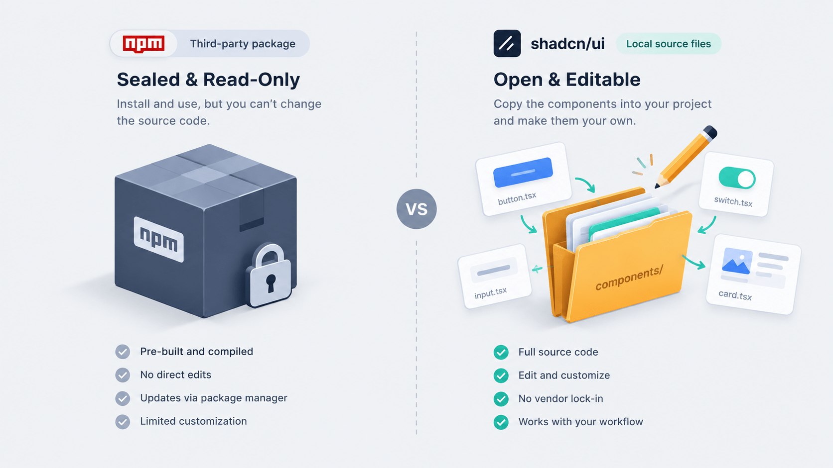
- Full control. If you don’t like the default padding on a button, open
button.tsxand changepx-4topx-6. You own the source code. - No vendor lock-in. A library update can’t break your app, because the code lives in your repo. The trade-off is that you also own the maintenance, so bug fixes and upgrades are yours to merge.
- Built on solid tools. It uses the same architecture from the last two posts: Radix UI for accessibility and state, and Tailwind CSS for styling.
- A standard structure. It sets one folder layout (
components/ui) and one way to merge classes, thecnutility.
Also Read: Utility-First CSS with Tailwind v4: Mental Models and Avoiding Spaghetti Classes
Those four points sound abstract until you read a real component, so let us open one.
Anatomy of a Shadcn UI Component
Run npx shadcn@latest add button and the CLI generates a file like the one below. It leans on class-variance-authority (CVA), the standard way to handle variants such as size, color, or state in a Tailwind project. The CVA docs explain the full API.
tsx
// components/ui/button.tsx
import * as React from "react"
import { Slot } from "@radix-ui/react-slot"
import { cva, type VariantProps } from "class-variance-authority"
import { cn } from "@/lib/utils" // Our trusty tailwind-merge utility

// 1. Define the variants using CVA
const buttonVariants = cva(
  "inline-flex items-center justify-center whitespace-nowrap rounded-md text-sm font-medium transition-colors focus-visible:outline-none focus-visible:ring-1 focus-visible:ring-ring disabled:pointer-events-none disabled:opacity-50",
  {
    variants: {
      variant: {
        default: "bg-primary text-primary-foreground shadow hover:bg-primary/90",
        destructive: "bg-destructive text-destructive-foreground shadow-sm hover:bg-destructive/90",
        outline: "border border-input bg-background shadow-sm hover:bg-accent hover:text-accent-foreground",
        secondary: "bg-secondary text-secondary-foreground shadow-sm hover:bg-secondary/80",
        ghost: "hover:bg-accent hover:text-accent-foreground",
        link: "text-primary underline-offset-4 hover:underline",
      },
      size: {
        default: "h-9 px-4 py-2",
        sm: "h-8 rounded-md px-3 text-xs",
        lg: "h-10 rounded-md px-8",
        icon: "h-9 w-9",
      },
    },
    defaultVariants: {
      variant: "default",
      size: "default",
    },
  }
)

export interface ButtonProps
  extends React.ButtonHTMLAttributes<HTMLButtonElement>,
    VariantProps<typeof buttonVariants> {
  asChild?: boolean
}

// 2. Build the component
const Button = React.forwardRef<HTMLButtonElement, ButtonProps>(
  ({ className, variant, size, asChild = false, ...props }, ref) => {
    // Radix Slot allows polymorphic rendering (e.g., rendering a button as a <Link>)
    const Comp = asChild ? Slot : "button"

    return (
      <Comp
        className={cn(buttonVariants({ variant, size, className }))}
        ref={ref}
        {...props}
      />
    )
  }
)
Button.displayName = "Button"

export { Button, buttonVariants }
Heads up: a new project on Tailwind v4 and React 19 gets a slightly different file. The Shadcn UI Tailwind v4 notes say forwardRef was removed, ref now arrives as a normal prop, and every primitive gets a data-slot attribute for styling. The CVA, cn, and asChild logic stays the same, so everything below still applies.
Breaking Down the Button Code
Three pieces do the heavy lifting in this file:
cva(Class Variance Authority): It organizes your Tailwind classes into base classes (applied to every button) and variants (likedestructiveoroutline). Developers get a clean, typed API:<Button variant="destructive" size="sm">.- The
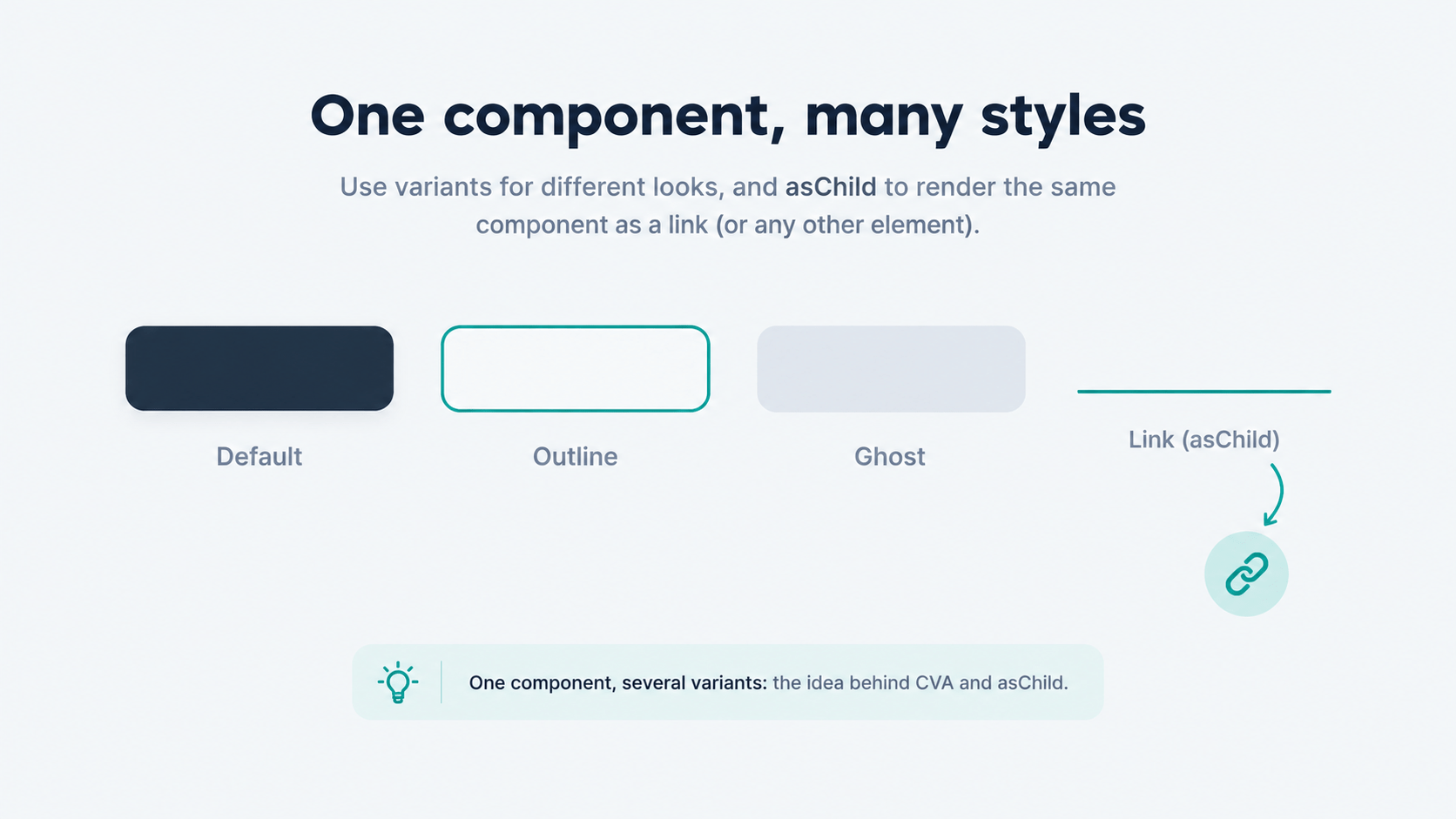
cnutility: It merges anyclassNamethe consumer passes with the CVA classes and resolves Tailwind conflicts for you. asChildandSlot: Sometimes you want a button’s look but a link’s meaning, like<Link href="/home">. WithasChild, the<Button>doesn’t render a<button>tag. It passes its classes and event listeners to the child you provide. This pattern comes from the Radix Slot utility.
Using the asChild Pattern
tsx
// Using the asChild pattern
<Button asChild variant="outline">
  <Link href="/dashboard">Go to Dashboard</Link>
</Button>
This renders a standard Next.js <Link> that looks exactly like an outlined button. Search engines and screen readers see a real link, and users see a button.
Theming Shadcn UI with CSS Variables
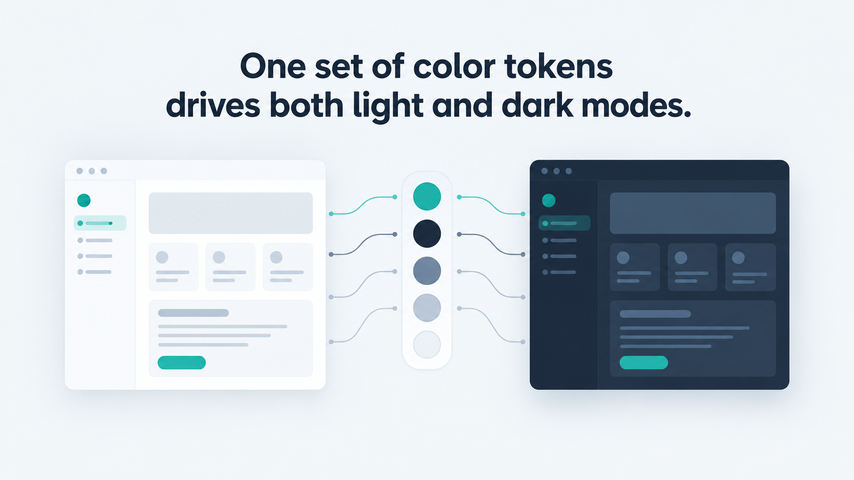
Shadcn UI works with Tailwind v4, but it handles colors differently from plain Tailwind so that theming (like instant dark mode) stays simple. Instead of hardcoding colors like bg-blue-600, it maps semantic names to CSS variables in app/globals.css.
css
/* app/globals.css */
@import "tailwindcss";
@custom-variant dark (&:is(.dark *));

:root {
  --background: oklch(1 0 0);
  --foreground: oklch(0.145 0 0);
  --primary: oklch(0.205 0 0);
  --primary-foreground: oklch(0.985 0 0);
  --destructive: oklch(0.577 0.245 27.325);
}

.dark {
  --background: oklch(0.145 0 0);
  --foreground: oklch(0.985 0 0);
  --primary: oklch(0.922 0 0);
  --primary-foreground: oklch(0.205 0 0);
  --destructive: oklch(0.704 0.191 22.216);
}

@theme inline {
  --color-background: var(--background);
  --color-foreground: var(--foreground);
  --color-primary: var(--primary);
  --color-primary-foreground: var(--primary-foreground);
  --color-destructive: var(--destructive);
}
Your Tailwind classes now read bg-primary text-primary-foreground. When a user switches to dark mode, the .dark class swaps the variables at the root and the whole UI updates without React re-rendering your components.
Two mistakes cost people the most debugging time. First, older tutorials store raw HSL numbers and wrap them in hsl(), while current projects use OKLCH values, so don’t mix the two formats in one project or colors can fail silently. Second, the Shadcn UI theming docs explain that a new token in :root does nothing until you expose it with a matching --color-* line inside @theme inline.
Building Your Organization’s Design System with Shadcn UI
In an enterprise team, you don’t scatter Shadcn UI across feature code. You use it to build your internal design system. The workflow looks like this:
- Your design team creates a shared design language in Figma.
- The UI engineering team uses the CLI to pull the primitives it needs into a shared monorepo package, for example
@devpulse-org/ui. - That team edits the generated code (CVA variants, padding, animations) until it matches the Figma designs.
- Feature teams import components from the internal package.
tsx
// Feature team code
import { Button, Dialog } from "@devpulse-org/ui"

export function UserSettings() {
  // ...
}
The result is one accessible, consistent design system across the company, and your organization owns and maintains every line of its source code.
Frequently Asked Questions
Is Shadcn UI a component library?
Not in the npm sense. Shadcn UI is a set of component source files that a CLI copies into your project. You still install the packages underneath, like Radix UI and CVA, but the components themselves are your code.
Does Shadcn UI work with Tailwind v4 and React 19?
Yes. Since the Tailwind v4 update, new projects start on Tailwind v4 and React 19, and colors moved from HSL to OKLCH. Existing Tailwind v3 and React 18 projects keep working until you upgrade.
How do I update a component I already added?
Running the add command again overwrites the file. Commit your changes first, then compare the new version with your edits and merge the parts you want to keep.
Do I need Next.js to use Shadcn UI?
No. The docs include framework-specific setup guides, and Next.js is only one of them. If you are following our React and Next.js tutorial series, you can add these components to that same project.
Conclusion
Tailwind gives you styles, Radix gives you behavior, and Shadcn UI gives you both as code you own. Start small with Shadcn UI: run npx shadcn@latest add button, open the file, and change one variant to see how it feels.
A modern app also shouldn’t snap from state to state, so it needs motion. In the next post, we will finish Phase 6 with micro-interactions and animation, using Framer Motion for layout transitions and modern CSS like @starting-style for entry and exit effects without heavy JavaScript libraries.