
We have spent the last three posts building a robust, accessible, and highly maintainable visual architecture. We’ve styled with Tailwind v4, structured behavior Framer Motion and a few new CSS features are all it takes to make a React interface feel alive. Over the last three posts, we styled our app with Tailwind v4, structured its behavior with Radix UI, and pulled everything into a design system with shadcn/ui.
But a polished interface doesn’t just snap from one state to another. In the physical world, objects have momentum. When a modal appears or a list item vanishes with no transition, the change feels abrupt and cheap.
In this post, we’ll look at two ways to fix that. Modern CSS handles lightweight transitions, and Framer Motion handles complex orchestration and layout animations. Let us break down when to use each.
Also Read: Utility-First CSS with Tailwind v4: Mental Models and Avoiding Spaghetti Classes
Modern CSS Transitions for Simple Animations
Historically, CSS was great for hover effects but poor at mounting and unmounting elements, like opening a modal or removing an item from a list. When an element left the DOM, it vanished instantly. There was no way to animate the exit.
That has changed. For basic fades and scales, you often don’t need a JavaScript library anymore.
The Problem With Animating display: none
Say we have a tooltip that should fade in when it mounts and fade out before it disappears. Here’s the old approach:
css
/* The old, broken way */
.tooltip {
  display: none;
  opacity: 0;
  transition: opacity 0.3s;
}

.tooltip.visible {
  display: block;
  opacity: 1;
}
This didn’t work. Because display: none removes the element from the render tree, the browser couldn’t calculate the steps between opacity: 0 and opacity: 1. The tooltip just snapped into view.
The Fix: @starting-style and transition-behavior
Modern CSS gives us two tools for this. @starting-style defines the state of an element before its first render, so the browser has something to transition from. transition-behavior: allow-discrete tells the browser to let the opacity transition finish before it applies display: none.
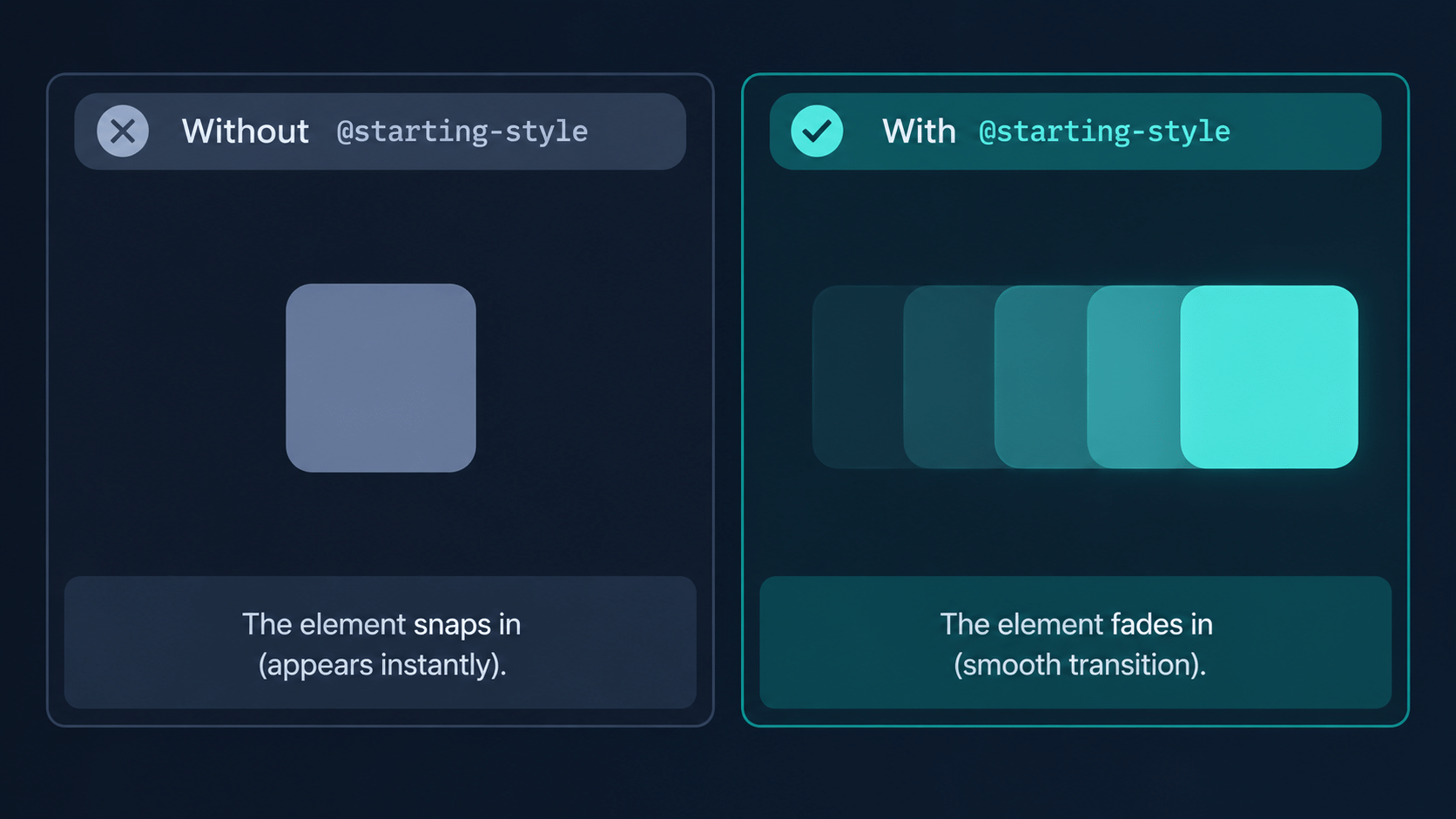
Browser support is solid. MDN lists @starting-style as Baseline since August 2024, with support in Chrome 117, Firefox 129, and Safari 17.5.
css
/* The modern CSS way */
.dialog {
  /* 1. Normal state */
  display: block;
  opacity: 1;
  transform: scale(1);

  /* Allow transitions on display changes */
  transition: opacity 0.3s ease, transform 0.3s ease;
  transition-behavior: allow-discrete;
}

/* 2. State when hidden */
.dialog.hidden {
  display: none;
  opacity: 0;
  transform: scale(0.95);
}

/* 3. The state to start from when FIRST mounting */
@starting-style {
  .dialog:not(.hidden) {
    opacity: 0;
    transform: scale(0.95);
  }
}
This gives us a fade-and-scale entrance and exit with zero JavaScript. Radix UI and shadcn/ui take a slightly different route. Their components use classes like data-[state=open]:animate-in and data-[state=closed]:animate-out, which are keyframe animations that Radix waits on before it unmounts the element. @starting-style is a lighter option when you don’t need keyframes.
Framer Motion for Complex Animations
Modern CSS handles simple fades and scales well. It breaks down when we need three things:
- Layout animations: Moving an element smoothly from one place in the DOM to another, like sorting a list or expanding an image from a grid into a modal.
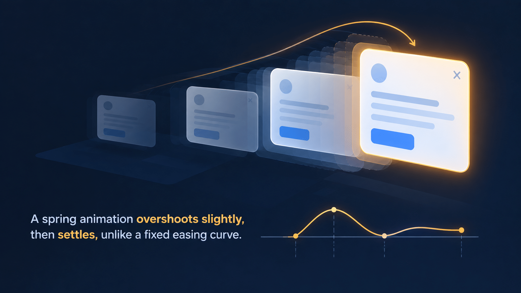
- Spring physics: Realistic mass, stiffness, and damping instead of fixed bezier curves.
- Orchestration: Staggering children so list items fade in one by one.
For these, most React projects reach for Framer Motion. One quick note on naming: the library is now maintained under the name Motion. New projects can install motion and import from motion/react. The examples below use the classic framer-motion package, which you’ll still see in most codebases.
How Framer Motion Works: The Mental Model
Framer Motion revolves around the motion component. Instead of rendering a plain <div>, you render a <motion.div>, which accepts special props that describe its animation states.
Four props do most of the work:
initial: the starting state of the element.animate: the target state it animates to.exit: the state it animates to before being unmounted.transition: how the animation behaves, including duration, easing, or spring physics.
Example 1: A Spring-Loaded Modal
Let’s animate a modal with spring physics. Springs feel more organic than CSS easing curves because the motion responds to mass and stiffness instead of a fixed timeline.
jsx
import { motion, AnimatePresence } from 'framer-motion';

export function Modal({ isOpen, onClose, children }) {
  return (
    // AnimatePresence is required to animate elements OUT of the React tree
    <AnimatePresence>
      {isOpen && (
        <div className="fixed inset-0 z-50 flex items-center justify-center">
          {/* The Backdrop */}
          <motion.div
            initial={{ opacity: 0 }}
            animate={{ opacity: 1 }}
            exit={{ opacity: 0 }}
            onClick={onClose}
            className="absolute inset-0 bg-black/50"
          />

          {/* The Modal Content */}
          <motion.div
            role="dialog"
            aria-modal="true"
            initial={{ opacity: 0, scale: 0.9, y: 20 }}
            animate={{ opacity: 1, scale: 1, y: 0 }}
            exit={{ opacity: 0, scale: 0.95, y: 10 }}
            transition={{
              type: "spring",
              damping: 25,
              stiffness: 300
            }}
            className="relative z-10 bg-white p-6 rounded-xl shadow-xl w-full max-w-md"
          >
            {children}
          </motion.div>
        </div>
      )}
    </AnimatePresence>
  );
}
Notice the <AnimatePresence> wrapper. It delays the actual React unmount until the exit animation finishes. Without it, React would remove the modal instantly and the exit prop would never play.
Example 2: Layout Animations With the layout Prop
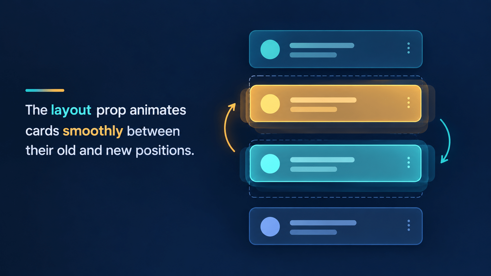
The layout prop does the heaviest lifting in Framer Motion. Imagine a list of user cards that re-orders alphabetically when you click a toggle. In standard React, the DOM nodes snap to their new positions in a single frame.
Add the layout prop, and the library measures each element’s size and position before and after the change, then animates between them.
jsx
import { motion } from 'framer-motion';
import { useState } from 'react';

export function UserList({ users }) {
  const [isSorted, setIsSorted] = useState(false);

  const displayUsers = isSorted
    ? [...users].sort((a, b) => a.name.localeCompare(b.name))
    : users;

  return (
    <div>
      <button onClick={() => setIsSorted(!isSorted)}>Toggle Sort</button>

      <ul className="flex flex-col gap-2 mt-4">
        {displayUsers.map(user => (
          <motion.li
            key={user.id}
            layout // The magic word
            transition={{ type: "spring", stiffness: 400, damping: 30 }}
            className="p-4 bg-gray-100 rounded-lg"
          >
            {user.name}
          </motion.li>
        ))}
      </ul>
    </div>
  );
}
If a user moves from index 0 to index 5, Framer Motion handles the math using a technique called FLIP (First, Last, Invert, Play). It slides that card down the list while the other items move out of the way.
Also Read: Headless UI & Accessibility: Building Behavioral Primitives
Micro-Interactions With Framer Motion: Small Details That Matter
Animations shouldn’t be long, and they shouldn’t be distracting. The goal of a micro-interaction is quick, subtle feedback that tells the user the interface heard them. Framer Motion turns each of the three below into a single prop.
- Hover states: Don’t just change a background color. Scale a card up slightly (
whileHover={{ scale: 1.02 }}) to show it’s interactive. - Click feedback: Add a tiny tap animation with
whileTap={{ scale: 0.95 }}so buttons feel physical. - Loading states: Use skeleton loaders that gently pulse instead of jarring, high-contrast spinners.
Here’s the click feedback in a real button:
jsx
<motion.button
  whileTap={{ scale: 0.95 }}
  transition={{ type: "spring", stiffness: 400, damping: 17 }}
  className="px-4 py-2 rounded-lg bg-black text-white"
>
  Save changes
</motion.button>
Respect Reduced Motion
Some users get distracted or dizzy from screen movement, and their operating system lets them say so with a “reduce motion” setting. Your animations should listen.
In CSS, wrap non-essential transitions in a media query. In Framer Motion, one wrapper does it for the whole app:
jsx
import { MotionConfig } from 'framer-motion';

export function App({ children }) {
  return <MotionConfig reducedMotion="user">{children}</MotionConfig>;
}
With reducedMotion="user", Framer Motion follows the device setting and turns off transform and layout animations for those users. It’s a one-line fix that keeps the accessibility work from the Radix post intact.
FAQ
Is Framer Motion the same as Motion?
Yes. Framer Motion was renamed Motion, and the same library now lives at motion.dev. Older projects still use the framer-motion package on npm, while new projects can install motion and import from motion/react. The core props (initial, animate, exit) work the same way.
Should I use CSS transitions or Framer Motion?
Use CSS for simple hovers, fades, and dialog entrances. Switch to Framer Motion when you need layout animations, spring physics, or staggered children. Many projects use both.
Does Framer Motion work with shadcn/ui?
Yes. shadcn/ui components are plain React components, so you can wrap them in motion elements. For Radix-based dialogs, use the forceMount prop together with AnimatePresence so the exit animation can play.
Will animations slow down my app?
Not if you animate transform and opacity, which browsers can handle cheaply. Animating properties like width or top forces layout recalculation and can drop frames. We’ll dig into this in the next phase.
Conclusion
We’ve completely changed how we handle the frontend. We moved from writing custom CSS to composing Tailwind utility classes. We stopped building components from scratch and adopted the accessibility of Radix UI. We took ownership of our design system with shadcn/ui. And now we’ve added motion with modern CSS and Framer Motion.
Start small. Add whileTap to your main button, then try the layout prop on one list. You’ll feel the difference right away.
Looking good isn’t enough, though. Our apps also need to be fast. In Phase 7, we move to Web Performance and Core Web Vitals, starting with exactly what Google measures when it ranks the speed of your site.