
Utility-First CSS with Tailwind v4: Mental Model, New Features, and Clean Patterns
Utility-first CSS is where this series returns to the frontend, after several phases spent on the backend. We built enterprise APIs with NestJS, orchestrated deployments with Kubernetes, and integrated real-time Python AI microservices.
Building a scalable backend is a science. Building a scalable UI system is an art form masquerading as a science. As applications grow, CSS is historically the first thing to break down. Global scope leaks, specificity wars begin, and bundle sizes bloat.
In 2026, a lot of teams have settled on utility-first CSS to fix this, and Tailwind CSS is the tool leading that shift.
In this post, we’ll look at the mental model shift behind utility-first CSS, walk through the biggest changes in Tailwind CSS v4, and learn the patterns that stop your code from turning into an unreadable mess of “spaghetti classes.”
Also Read: AI Solutions Architect: 9 Essential Skills & Career Path
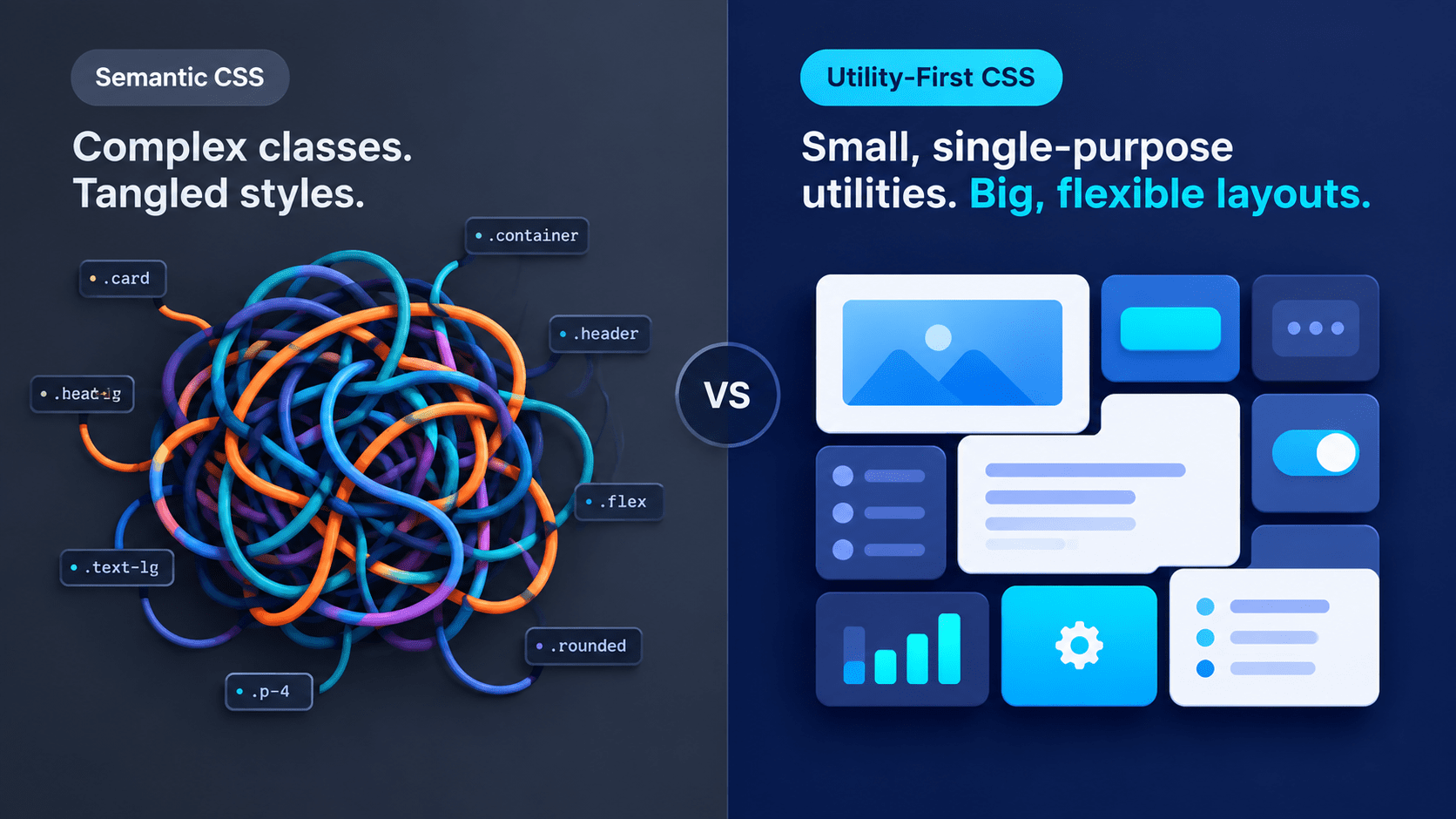
Why Utility-First CSS Beats Semantic CSS at Scale
If you come from the era of semantic CSS, like BEM (Block Element Modifier), or even CSS-in-JS with styled-components, your instinct is to separate structure from style. Here is what that looks like.
The Semantic CSS Way
<!-- The Semantic CSS Way -->
<button class="btn btn--primary">Save Changes</button>
/* In a separate style.css file */
.btn {
  padding: 0.5rem 1rem;
  border-radius: 0.375rem;
  font-weight: 600;
}
.btn--primary {
  background-color: #2563eb;
  color: white;
}
This looks clean in HTML, but at scale it creates real friction:
- Context switching: You keep jumping between
.tsxfiles and.cssfiles. - Naming fatigue: You burn brainpower inventing names like
.outer-wrapper-container. - Append-only stylesheets: Developers are afraid to delete CSS because they don’t know what it will break, so CSS payloads keep growing.
Utility-first CSS flips this around.
How Utility-First CSS Works in Tailwind
Instead of writing custom CSS, you apply pre-existing, single-purpose classes directly to your markup.
// The Utility-First Way
<button className="px-4 py-2 font-semibold text-white bg-blue-600 rounded-md hover:bg-blue-700">
  Save Changes
</button>
The benefits of utility-first CSS show up right away:
- Zero context switching: You style exactly where you define the structure.
- Deterministic output: You know exactly what
bg-blue-600does. It doesn’t depend on the cascade or parent selectors. - Dead code elimination: Tailwind scans your files and compiles only the classes you use. According to the Tailwind team, most projects ship less than 10kB of CSS to production.
Utility-first CSS pays off more as your app grows, and Tailwind v4 makes the whole workflow lighter.
What Changed in Tailwind CSS v4
If you used Tailwind v3, you probably remember tailwind.config.js. You had to configure content paths, extend themes, and install plugins by hand.
Tailwind v4 changed how utility-first CSS gets configured. It runs on a new Rust-based engine called Oxide. The Tailwind v4 announcement reports full builds up to 5x faster and incremental builds over 100x faster, with builds that need no new CSS finishing in microseconds.
Also Read: Developer Snacks: 7 Easy Ways to Beat Coding Fatigue
CSS-First Configuration in Tailwind v4
By default, there is no tailwind.config.js anymore. (A JavaScript config still loads through the @config directive if you need it.) In a modern Next.js App Router project, your setup lives in app/globals.css:

/* app/globals.css */
@import "tailwindcss";

@theme {
  /* You define design tokens using standard CSS variables */
  --font-sans: "Inter", sans-serif;
  --color-brand-primary: #4f46e5;
  --color-brand-secondary: #06b6d4;

  /* Adding a new breakpoint */
  --breakpoint-3xl: 120rem;
}

@utility glass-panel {
  /* Creating custom utilities natively */
  backdrop-filter: blur(16px);
  background: rgba(255, 255, 255, 0.05);
  border: 1px solid rgba(255, 255, 255, 0.1);
}
In Next.js you also register the @tailwindcss/postcss plugin, and Tailwind finds your template files on its own:
// postcss.config.mjs
const config = {
  plugins: {
    "@tailwindcss/postcss": {},
  },
};

export default config;
OKLCH Colors and Container Queries
Tailwind v4 moves its default color palette to OKLCH, which gives you more vivid colors on wide-gamut displays. Container queries are also built in, so you no longer need a plugin.
Mark a parent with @container, then style children with variants like @md:. The component now responds to its parent’s width instead of the global viewport.
<div class="@container">
  <div class="flex flex-col gap-4 @md:flex-row">
    <img class="w-full @md:w-1/3" src="/cover.png" alt="Book cover" />
    <p>This card switches to a row layout based on its container.</p>
  </div>
</div>
Check Browser Support Before You Upgrade
Tailwind v4 targets Safari 16.4+, Chrome 111+, and Firefox 128+. If you need older browsers, the Tailwind compatibility docs say to stay on v3.4 for now. Check your analytics before you upgrade.
Tailwind and Next.js Server Components
Tailwind pairs well with React Server Components (RSCs). It outputs a static .css file at build time, so the browser doesn’t need JavaScript to parse or inject styles. That makes it lighter than runtime CSS-in-JS libraries, and it is one more reason utility-first CSS fits the App Router model.
How to Avoid Spaghetti Classes in Utility-First CSS
The number one criticism of utility-first CSS is ugly, unreadable HTML. A single button can carry 20 classes.
//  The Spaghetti Anti-Pattern
<button className="inline-flex items-center justify-center rounded-md text-sm font-medium transition-colors focus-visible:outline-none focus-visible:ring-1 focus-visible:ring-ring disabled:pointer-events-none disabled:opacity-50 bg-primary text-primary-foreground shadow hover:bg-primary/90 h-9 px-4 py-2">
  Click Me
</button>
How do we keep our sanity? Two rules do most of the work.
Rule 1: Extract Components, Not @apply
The old instinct is to hide long class lists behind a custom class using Tailwind’s @apply directive. Avoid @apply wherever you can. It brings back the specificity and context-switching problems utility-first CSS was built to solve.
Extract the classes into a React component instead. React is your abstraction layer.
//  Do this: Extract to a React Component
export function PrimaryButton({ children, ...props }) {
  return (
    <button
      className="px-4 py-2 text-white transition-colors bg-blue-600 rounded-md hover:bg-blue-700"
      {...props}
    >
      {children}
    </button>
  );
}

// Usage elsewhere:
<PrimaryButton>Save</PrimaryButton>
Rule 2: Use the cn() Utility (clsx + tailwind-merge)
Reusable components built with utility-first CSS need dynamic classes, or a way to override defaults through props. What if a consumer wants a red button?
<PrimaryButton className="bg-red-600 hover:bg-red-700">Delete</PrimaryButton>
If you just concatenate strings, Tailwind can’t know whether bg-blue-600 or bg-red-600 should win. The result depends on the CSS cascade, which leads to unpredictable UI bugs.
The fix is a small helper called cn (short for classNames). It combines two libraries:
- clsx: joins class names together conditionally.
- tailwind-merge: resolves Tailwind conflicts, so
bg-red-600overridesbg-blue-600.
This is the helper you’ll see in shadcn/ui-style projects:
// lib/utils.ts
import { clsx, type ClassValue } from "clsx";
import { twMerge } from "tailwind-merge";

export function cn(...inputs: ClassValue[]) {
  return twMerge(clsx(inputs));
}
Now we can make the button robust, dynamic, and clean:
import { cn } from "@/lib/utils";

export function Button({ className, variant = "primary", ...props }) {
  return (
    <button
      className={cn(
        // Base styles applied to ALL buttons
        "inline-flex items-center justify-center px-4 py-2 rounded-md font-medium transition-colors focus:outline-hidden focus:ring-2 focus:ring-offset-2",

        // Conditional styles based on props
        variant === "primary" && "bg-blue-600 text-white hover:bg-blue-700",
        variant === "danger" && "bg-red-600 text-white hover:bg-red-700",
        variant === "ghost" && "bg-transparent text-slate-800 hover:bg-slate-100",

        // Allow consumers to override EVERYTHING
        className
      )}
      {...props}
    />
  );
}
One v4 detail: outline-none was renamed. Use outline-hidden if you want the old behavior, which keeps a visible outline in forced-colors mode. The Tailwind upgrade guide lists this and the other renamed utilities.
With cn, you keep the speed of utility-first CSS and get the clean, predictable API of a traditional component library.
Frequently Asked Questions About Utility-First CSS
Is @apply removed in Tailwind v4?
No. It still works. In component-scoped stylesheets you need to pull in your theme with @reference first, and for reusable UI a React component is usually the cleaner choice anyway.
Do I still need tailwind.config.js in Tailwind v4?
Not by default. You define tokens in CSS with @theme. If you have an older JavaScript config, you can still load it with @config.
Will Tailwind v4 work in older browsers?
Not reliably. It targets Safari 16.4+, Chrome 111+, and Firefox 128+. If your users are on older browsers, stay on v3.4 until your support requirements change.
Why use tailwind-merge if I already have clsx?
They solve different problems. clsx builds a class string from conditions, while tailwind-merge decides which conflicting Tailwind class wins. You need both for a component that accepts a className prop.
Is utility-first CSS harder to maintain than semantic CSS?
Not if you extract components. Utility-first CSS keeps styles next to the markup they belong to, so deleting a component also deletes its styles. There is no shared stylesheet to second-guess.
Next Steps
We now have our utility-first CSS engine and our mental model in place. But a button isn’t just a colored box. It needs to handle keyboard navigation, screen readers, and focus trapping.
Before the next post, try moving one button in your project to the cn pattern and see how much markup it cleans up.
In the next post, we’ll explore the Headless UI revolution, looking at libraries like Base UI and Radix UI. They provide the complex behavioral logic of UI components while letting you control the visual layer completely with Tailwind CSS.