
Headless UI is what turns a good-looking Tailwind component into one that works for everyone. In our previous post, we moved to utility-first styling with Tailwind v4 and learned how to build components fast without the spaghetti CSS of older methods.
But a solid UI component is more than a colored box.
Say you build a dropdown menu from a plain <div> and a few Tailwind classes. Does it trap focus when it opens? Can someone move through the items with the arrow keys? Does Escape close it? Does a screen reader announce that it opened?
Writing all of that from scratch for every component is slow and easy to get wrong. So modern teams separate how a component looks from how it behaves. In this post, we’ll look at how the headless UI approach works, compare Radix UI and Base UI, and build an accessible modal in React.
Also Read: Utility-First CSS with Tailwind v4: Mental Models and Avoiding Spaghetti Classes
Why UI Components Are Harder Than They Look
Let’s look at a simple component: a modal, also called a dialog. A naive version might look like this:
jsx
// A naive, inaccessible modal
function SimpleModal({ isOpen, onClose, children }) {
  if (!isOpen) return null;

  return (
    <div className="fixed inset-0 z-50 flex items-center justify-center bg-black/50">
      <div className="relative w-full max-w-md rounded-lg bg-white p-6">
        <button onClick={onClose} className="absolute right-2 top-2">
          Close
        </button>
        {children}
      </div>
    </div>
  );
}
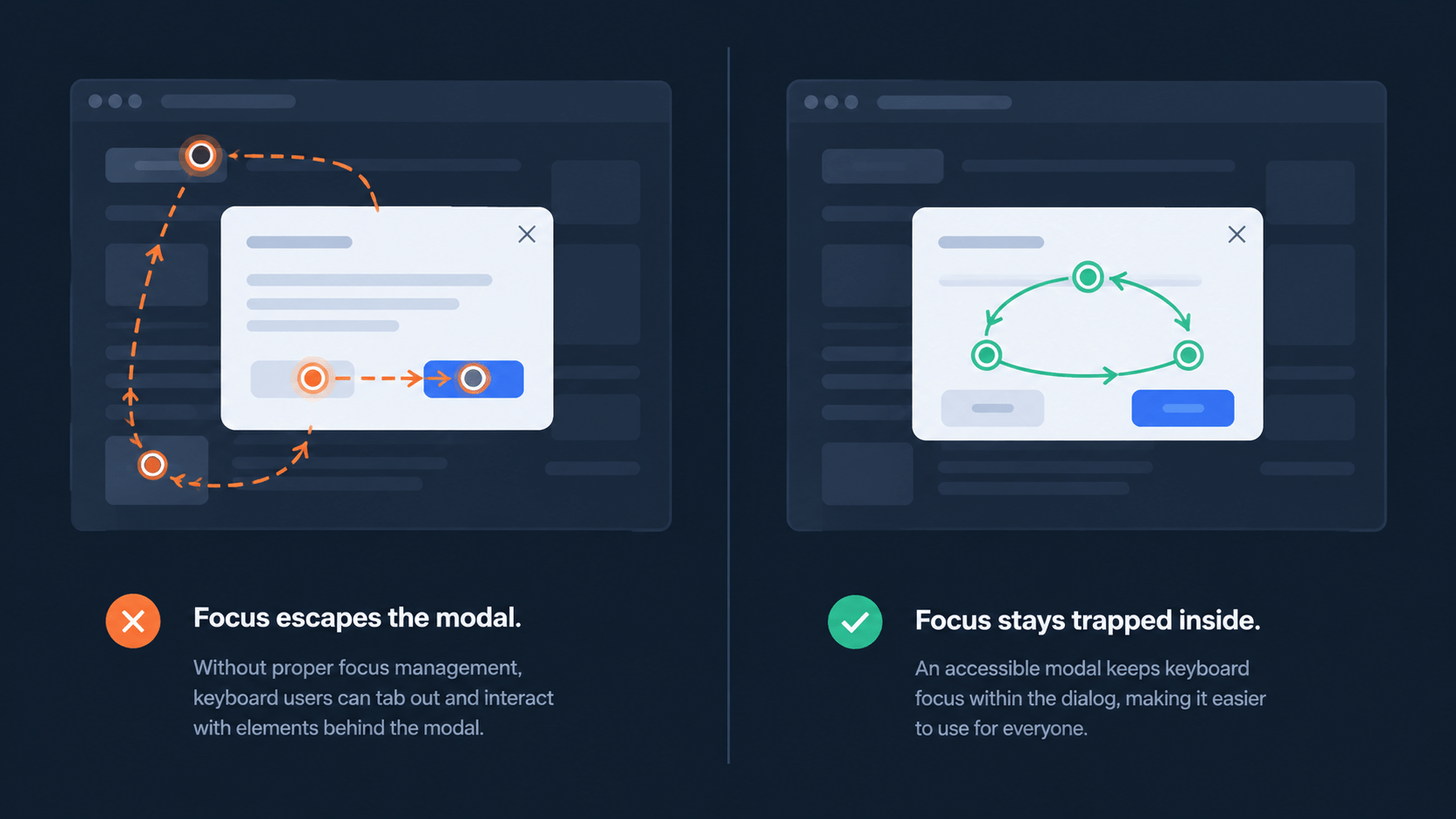
It looks fine on screen. For keyboard and screen reader users, it breaks in four ways:
- No focus management: When the modal opens, keyboard focus stays on the button underneath the overlay.
- No focus trapping: Pressing Tab moves focus to hidden elements outside the modal.
- No keyboard dismissal: Pressing Escape does nothing.
- No screen reader context: Assistive tech doesn’t know this is a dialog, or that the rest of the page is blocked.
Fixing these by hand means useEffect hooks, ref management, and a solid grasp of the WAI-ARIA authoring practices for modal dialogs. That’s a lot of work for one component. You’d repeat it for menus, tabs, tooltips, and selects too.
What Is Headless UI?
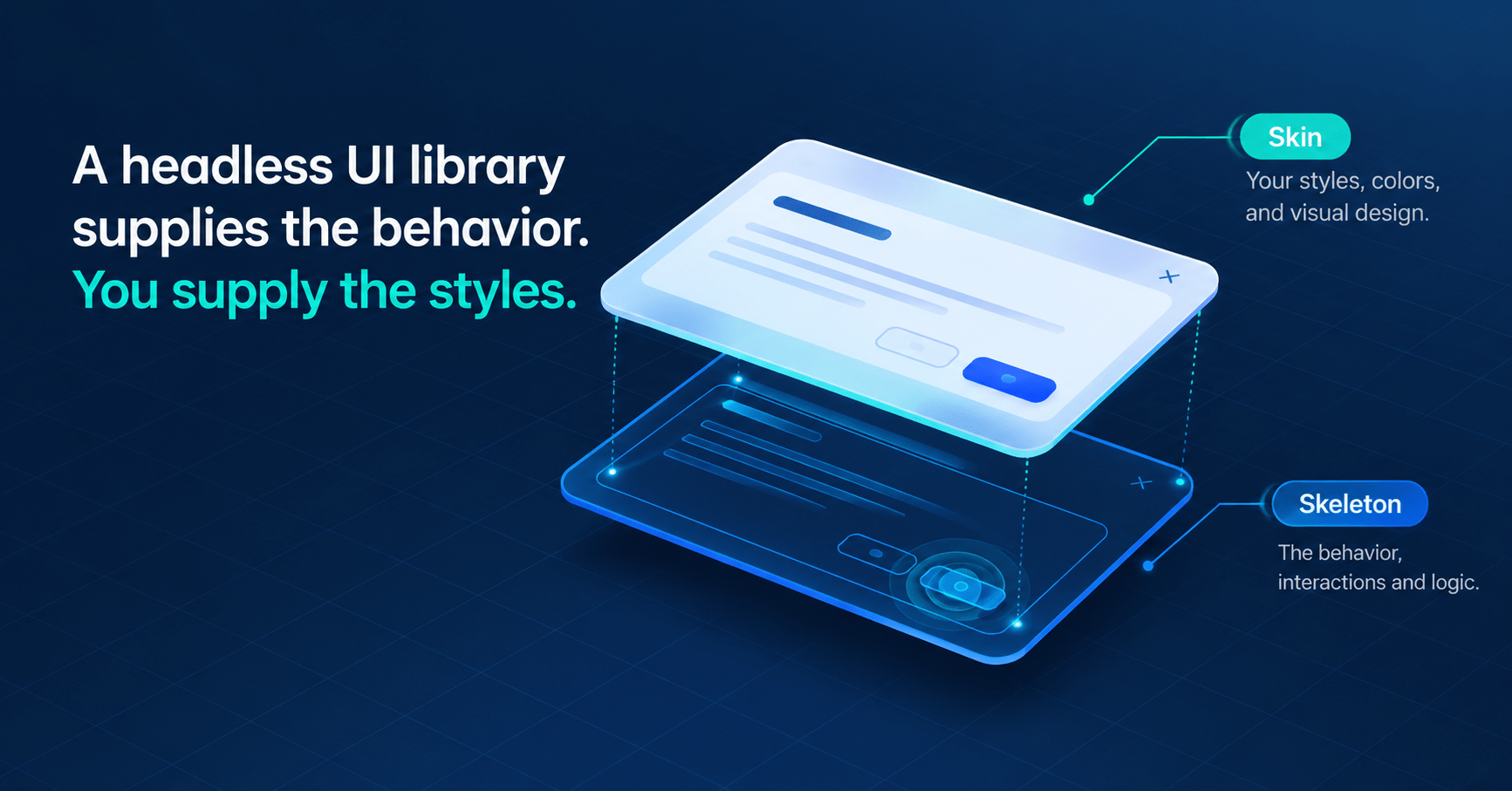
A headless UI library gives you the logic, state management, and accessibility of a complex component, but renders no styles. You get the functional skeleton. You add the visual skin, which in our case is Tailwind CSS.
One naming note before we go further. Headless UI is also the name of a specific library from Tailwind Labs, available at headlessui.com. In this post, headless UI means the general approach, and our examples use Radix UI.
Also Read:10 Must have Digital Marketing Tools to Elevate SEO Campaigns
Two Popular Headless UI Libraries: Radix UI and Base UI
Two libraries come up most often in React projects today:
- Radix UI Primitives: Unstyled, accessible components for React. It’s the primitive layer behind many shadcn/ui components, which we’ll cover in the next post.
- Base UI: The headless library from the team behind Material UI. It has a stable 1.0 release, and the Base UI release notes show what’s shipped since.
They aren’t the only options. React Aria from Adobe and Ark UI are worth a look too. Both Radix UI and Base UI work with React 19.
Which one should you pick? If you already use shadcn/ui or Radix, there’s no urgent reason to switch. For a brand-new project, read the Base UI docs before you decide. The mental model is the same either way: you compose small parts, and the library handles behavior.
Build an Accessible Modal With Radix UI
Install the dialog primitive first:
bash
npm install @radix-ui/react-dialog
Then compose the parts. The cn helper is the Tailwind merge utility from our last post.
jsx
// An accessible modal using Radix UI Dialog
import * as Dialog from "@radix-ui/react-dialog";
import { cn } from "@/lib/utils";

export function AccessibleModal({ triggerText, title, description, children }) {
  return (
    <Dialog.Root>
      {/* asChild merges Radix props (aria-expanded, aria-controls) onto our button */}
      <Dialog.Trigger asChild>
        <button className="rounded-md bg-blue-600 px-4 py-2 text-white">
          {triggerText}
        </button>
      </Dialog.Trigger>

      {/* Portal renders the modal at the end of the body */}
      <Dialog.Portal>
        {/* Overlay is the dimmed backdrop behind the modal */}
        <Dialog.Overlay className="fixed inset-0 z-50 bg-black/50 backdrop-blur-sm" />

        {/* Content sets role="dialog", moves focus in, and traps it */}
        <Dialog.Content
          className={cn(
            "fixed left-1/2 top-1/2 z-50 w-full max-w-lg -translate-x-1/2 -translate-y-1/2",
            "rounded-xl border border-gray-200 bg-white p-6 shadow-lg"
          )}
        >
          <Dialog.Title className="mb-2 text-lg font-semibold text-gray-900">
            {title}
          </Dialog.Title>
          <Dialog.Description className="mb-4 text-sm text-gray-600">
            {description}
          </Dialog.Description>

          <div className="text-gray-600">{children}</div>

          {/* Close returns focus to the trigger */}
          <Dialog.Close asChild>
            <button
              className="absolute right-4 top-4 text-gray-400 hover:text-gray-600"
              aria-label="Close"
            >
              <svg className="size-5" fill="none" stroke="currentColor" viewBox="0 0 24 24">
                <path strokeLinecap="round" strokeLinejoin="round" strokeWidth="2" d="M6 18L18 6M6 6l12 12" />
              </svg>
            </button>
          </Dialog.Close>
        </Dialog.Content>
      </Dialog.Portal>
    </Dialog.Root>
  );
}
Here’s what’s happening in that code:
- Composability: You don’t pass one huge config object to a single
<Dialog />component. You compose small parts: Trigger, Overlay, Content, Title, and Description. - The
asChildprop: By default, Radix renders its own DOM element, such as a<button>. WithasChild, Radix merges its props onto the child you provide instead. That includes ARIA attributes and event listeners, and it avoids extra DOM nesting. - Built-in accessibility: Content gets
role="dialog", and Title and Description link to it througharia-labelledbyandaria-describedby. Escape closes the modal, focus moves inside and stays trapped, and focus returns to the trigger when it closes.
One tip from the Radix Dialog docs: the Description is optional. If you leave it out, opt out explicitly by passing aria-describedby={undefined} to Dialog.Content.
Test the Headless UI Modal in 60 Seconds
Don’t just trust the code. Try it yourself:
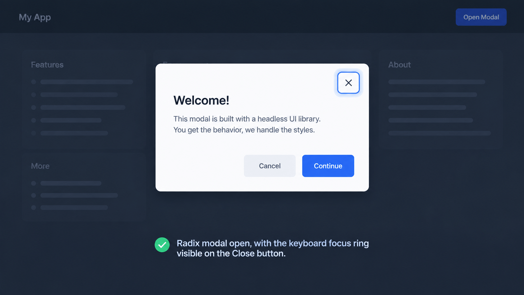
- Tab to the trigger button and press Enter. The modal should open.
- Press Tab several times. Focus should stay inside the modal.
- Press Escape. The modal should close, and focus should land back on the trigger.
Now run the same three steps on SimpleModal from earlier. You’ll feel the difference immediately.
Show Image
The 3 Accessibility Jobs Headless UI Handles for You
You’ll often see accessibility written as a11y. It’s a numeronym: there are 11 letters between the “a” and the “y.”
In professional teams, accessibility is a requirement, not a nice-to-have. It makes the web usable for people who rely on screen readers or keyboard navigation. Inaccessible software can also carry legal risk, such as ADA-related lawsuits in the US.
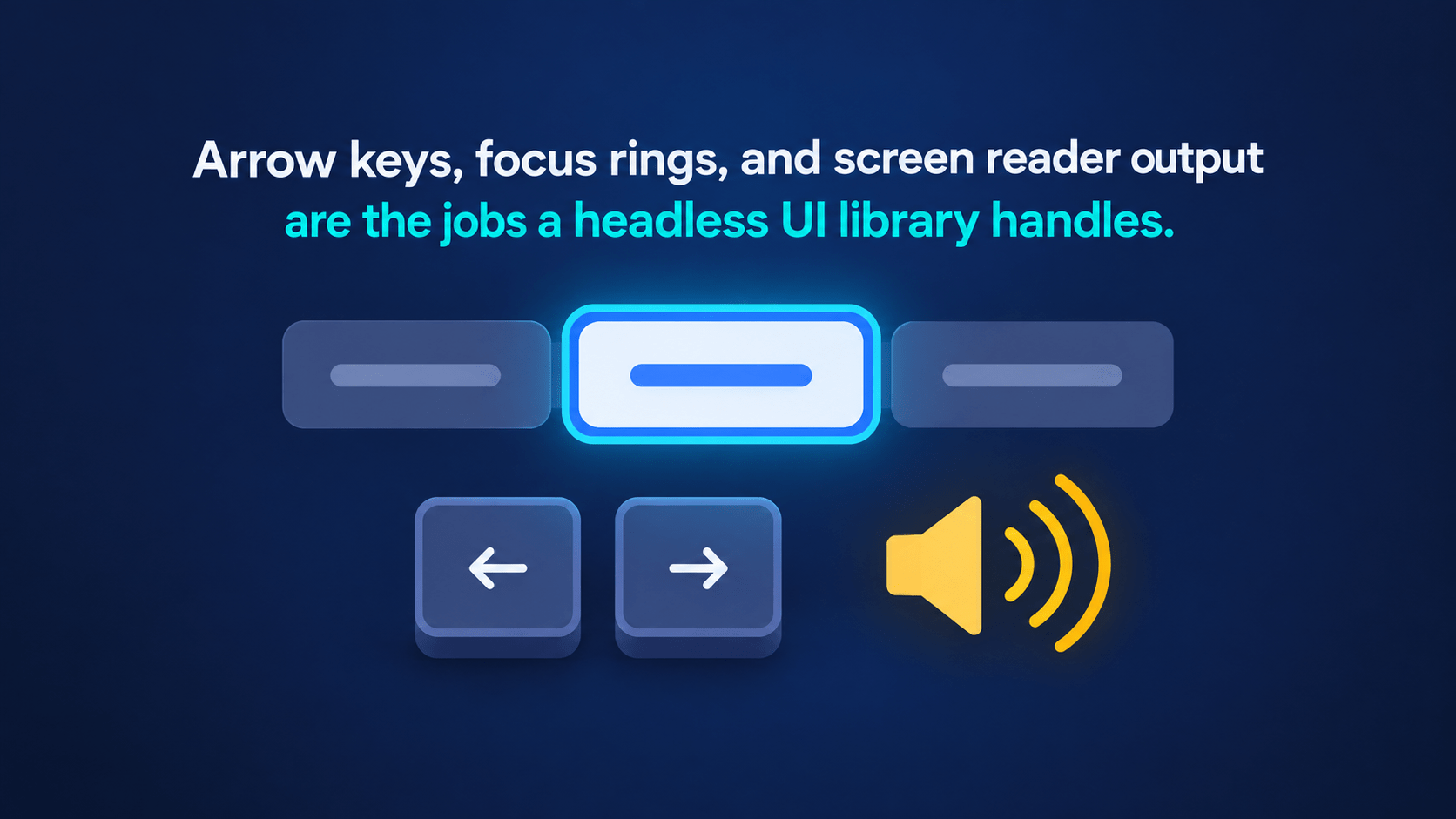
A headless UI library takes on three jobs so you don’t have to:
- ARIA attributes: ARIA (Accessible Rich Internet Applications) attributes like
aria-expanded,aria-hidden, androle="dialog"tell assistive technology what a component is and what state it’s in. You need them when native HTML falls short, and headless libraries update them as state changes. - Focus management: When a menu opens, focus moves into it. When it closes, focus returns to the button that opened it.
- Keyboard navigation: Components follow the interactions people expect. In a set of Tabs, users move between tabs with the Left and Right arrow keys, not the Tab key.
A library can’t fix everything, though. Accessible labels, color contrast, and page structure are still your job.
Show Image
Controlled vs Uncontrolled State in Headless UI Components
By default, headless UI components are uncontrolled. The library manages its own state, such as whether a dialog is open or closed, so you don’t need a useState hook for every component.
jsx
// Uncontrolled: Radix manages the open/closed state internally
<Dialog.Root>
  <Dialog.Trigger>Open</Dialog.Trigger>
  <Dialog.Portal>
    <Dialog.Content>...</Dialog.Content>
  </Dialog.Portal>
</Dialog.Root>
Sometimes you need to control the component yourself. A common case is closing a modal after an API call succeeds. For that, switch to a controlled component with the open and onOpenChange props:
jsx
// Controlled: you manage the state with React
import { useState } from "react";
import * as Dialog from "@radix-ui/react-dialog";

export function SubmitDialog() {
  const [isOpen, setIsOpen] = useState(false);

  const handleSubmit = async () => {
    await submitData(); // your own API call
    setIsOpen(false); // close it programmatically
  };

  return (
    <Dialog.Root open={isOpen} onOpenChange={setIsOpen}>
      <Dialog.Trigger>Open</Dialog.Trigger>
      <Dialog.Portal>
        <Dialog.Content aria-describedby={undefined}>
          <Dialog.Title>Save your changes</Dialog.Title>
          <button onClick={handleSubmit}>Submit</button>
        </Dialog.Content>
      </Dialog.Portal>
    </Dialog.Root>
  );
}
This lets you prototype quickly with uncontrolled components. You move to controlled ones only when your business logic needs it.
Frequently Asked Questions About Headless UI
What is headless UI in React?
Headless UI is a type of component library that supplies behavior, state, and accessibility but no styling. You bring your own CSS, such as Tailwind, and the library makes sure things like focus, keyboard support, and ARIA attributes work correctly.
Is Tailwind’s Headless UI the same as Radix UI?
No. Headless UI is a specific library from Tailwind Labs, while Radix UI is a separate project. Both follow the same headless idea, and both work well with Tailwind classes.
Radix UI or Base UI: which should I use?
Both are unstyled and accessible. If your project already uses Radix, or shadcn/ui built on it, staying put is a safe choice. For a new project, compare the component lists in both libraries’ docs and pick the one that covers what you need.
Do headless UI libraries work with Tailwind CSS v4?
Yes. Because they ship no styles, you style them with whatever you like, including Tailwind v4 classes. shadcn/ui also has guidance for using Tailwind v4 with React 19.
Do I still need to test accessibility manually?
Yes. A headless UI library handles the hard interaction patterns, but your labels, colors, and page structure still need checking. Try your UI with only a keyboard, and test with a screen reader such as NVDA or VoiceOver.
Conclusion
Headless UI splits a component into behavior and looks. Radix UI and Base UI give you the behavior, Tailwind gives you the looks, and your users get modals and menus that work with a keyboard and a screen reader.
Your next step: pick one hand-built modal or dropdown in your project this week and swap it for a Radix component. Then run the 60-second test above.
In the next post, we’ll build a design system with shadcn/ui, where Tailwind and Radix come together in a system you actually own.